Risk Graphs
Video tutorial
Overview
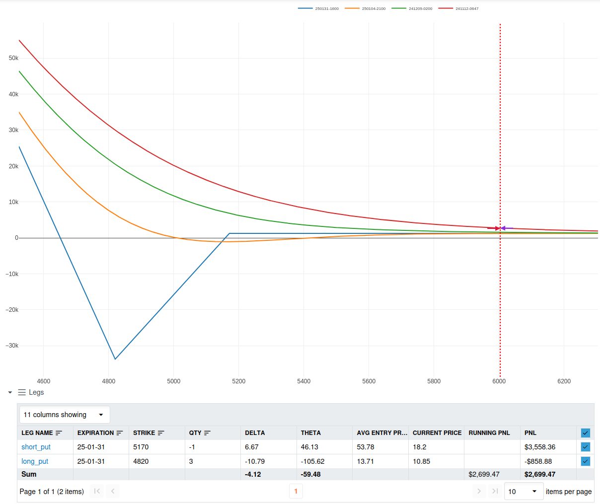
The Risk Graph is a tool designed for risk modeling, providing a visual representation of potential profit and loss (PnL) scenarios as the underlying asset price fluctuates. This helps traders assess risk and make informed decisions.

X-axis: Underlying Asset Price
This axis shows the price of the underlying asset. Moving along this axis simulates how different price points will impact the projected PnL.
Y-axis: Projected Profit and Loss
The Y-axis displays projected profit and loss values, helping traders assess potential gains or losses at various asset price points.
T+x Lines: PnL Projections Over Time
Each T+x line represents a different point in time, allowing traders to view how PnL is projected to evolve. These lines help visualize possible outcomes if the option position is closed before expiration.
Below the graph is the Legs Table, which displays all individual components of the strategy, called "legs." Each leg contains essential data, and you can toggle each one to control which are shown on the graph.
Black-Scholes Model
The Black-Scholes model is a widely used mathematical model for calculating theoretical option prices. It takes into account factors such as:
- Volatility of the underlying asset.
- Time to expiration of the option.
- Interest rates and dividends.
In the Risk Graph, Black-Scholes is used to project PnL values for each leg of the strategy at different asset price points. While the model does not account for all market dynamics, it provides a robust estimate for risk analysis and strategy planning.
Steps to Use the Risk Graph
- View PnL Projections: Observe the T+x lines on the graph to understand how PnL is likely to change over time and at different underlying asset prices.
- Check Leg Details: Refer to the Legs Table below the graph for specific details about each position leg, such as delta, theta, entry price, and running PnL.
- Use Toggles: Toggle individual legs to isolate specific PnL contributions or analyze the full strategy at once.